Recycling Logistics Overview: Making an Impact
Welcome to our Recycling Logistics Overview, a visual representation of the impactful journey your textile donations take within our circular fashion ecosystem. At SustainaCycle, we are committed to transforming the fashion industry by bridging the gap between manufacturers, individual users, and recycling centers for textiles. Explore the insightful data visualizations below to witness the positive impact we've collectively made on sustainability.
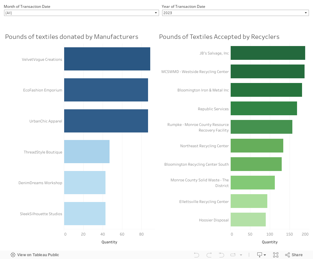
Textile Waste Donation and Recycling Insights
Explore the impact of textile waste donations by manufacturers and the recycling efforts of partnered recyclers. This dashboard provides a comprehensive overview, showcasing manufacturers ranked by the quantity of textile waste donated, and recyclers recognized for accepting the most waste. Gain insights into the sustainability efforts within the textile industry and understand the positive environmental contributions made by manufacturers and recyclers alike. Discover the leaders driving positive change and contributing to a more sustainable future through responsible waste management practices. Use the filters at the top of the dashboard to filter down by month and year.
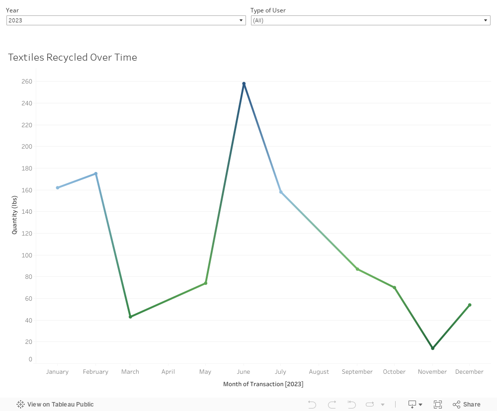
Textiles Recycled Over Time: Tracing our Environmental Footprint
Our line chart illustrates the evolving pattern of textile donations over time. Witness the growth of our community's commitment to sustainability, as reflected in the quantities of textiles recycled. Each data point represents a step towards reducing environmental impact, making a lasting mark on the fashion industry's approach to responsible production and consumption.
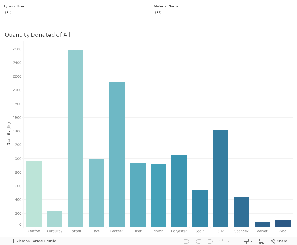
Types of Textiles Recycled: Diverse Contributions for a Colorful Impact
The bar chart reveals the diverse types of textiles recycled on our platform. Explore the proportions of each material recycled, measured in pounds. From cotton and polyester to innovative eco-friendly fabrics, our community's contributions paint a colorful picture of sustainability in fashion.
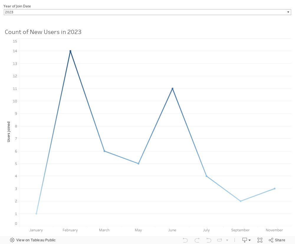
User Growth Over Time
Explore the dynamic growth of our user community over time with this insightful line chart. The chart visualizes the number of users who have joined our platform during different time periods. Gain valuable insights into the growth patterns, identify key milestones, and understand the trajectory of user engagement. Whether you're tracking the success of a marketing campaign or monitoring organic growth, this chart provides a clear representation of how our user base has evolved, helping you make informed decisions for the future.